
|
|||
|
How to tell good art from bad (continued)
Fixing Some Problems
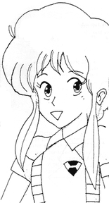
Of all the characters, Rabby needed the most work. (This is not because the others were better but because there is more of Rabby visible.) I started by fixing her head, particularly the chin line and face.
The body pose is no good and the form is strange and fat. The worst part was the arm positioning and the shoulders. I dropped the shoulders and redrew her torso (note the addition of the particularly feminine parts that seem to have been left off in the original) and vest. In the original the orientation of her belt seems to imply that she's thrusting her crotch at the camera, which is not what we want in this image so I changed the belt angle. I cleaned up her hair and made it look softer and made the curves deeper to accentuate the feminine qualities.
I concentrated only on the visible parts of Patty's body. The artist didn't see the character in 3D space so her pose is very wrong in comparison to the others but I'm just redrawing the character here rather than redoing the whole image. Her eyes were off model and her shoulders were wrong so I fixed both. In the original image it looked like her hair was a bunch of wet seaweed dropped on her head so I've made it look more like hair. The eyes are still off but that is mostly due to a pencil lines that are too heavy around the left. This will be easy to fix when cleaning it up.
Lumy was pretty much a lost cause. She was so close to Rabby that they must have been sharing some body parts. She is way out of proportion and her head was larger than Patty's torso. The artist must not have liked this character very much as she's the sketchiest and least finished. This is a common problem with fan art. People only want to draw the characters they like and pay little attention to the others. This is why most fans drop out of animation school and companies—for the first couple years all you draw is things that you don't care about like shoes, doorknobs, background characters, bubbling stewpots, dead rats and such. If you treat each character with respect then you will create a much better image!
 It still doesn't make me happy. I don't like the poses and the bodies still need to be worked out more. It is a lot more interesting than the previous image though. At least the characters seem to be concerned with something rather than acting like three silly schoolgirls (with a gun) posing for some passing cameraman.

|